Darzin
UX / UI / Branding / iOS / Android
Client: Darzin | Completed: 2015 – 2018

The Brief
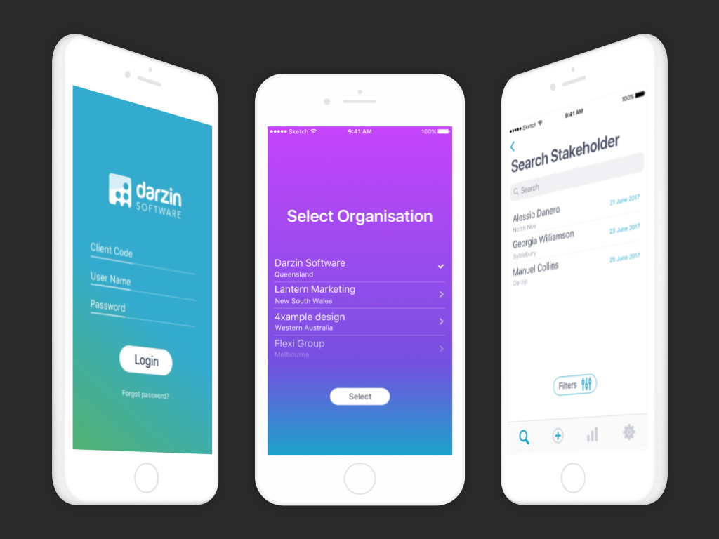
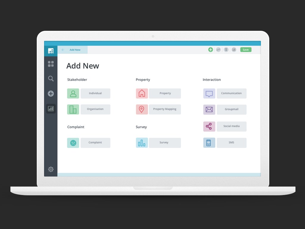
Darzin software is an Australian company working with government organisations to manage consultation programs. I was engaged to develop the user experience strategy, design and interaction design for Version 5 of the Darzin stakeholder management system, the website and mobile app.
My Role
I lead the UX piece and produced all key deliverables between November 2015 and July 2018. I worked closely with a product manger and owner as well as the engineering team during the implementation phase.
The Challenge
Existing systems were built on old technology and principles, which no longer satisfied users needs. Mapping workflows for the new system was also challenging as there are many different touchpoints within the system for customers using Darzin, which needed to be understood thoroughly.

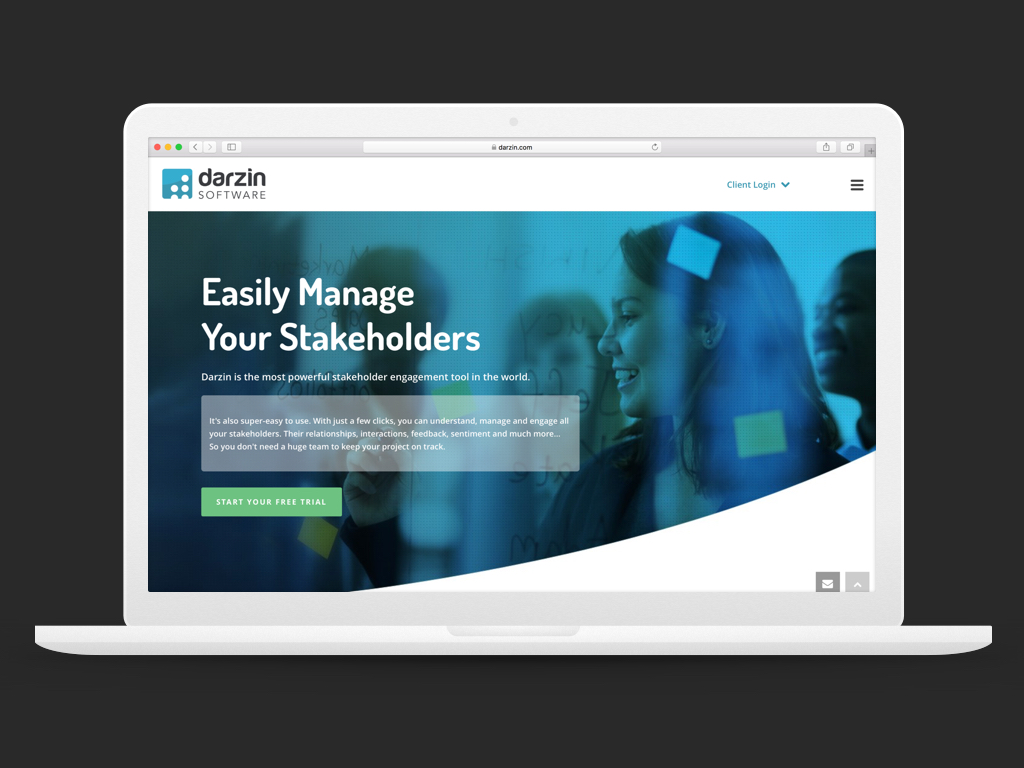
Darzin Website
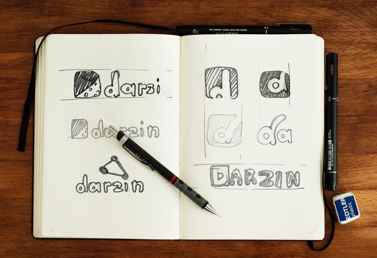
Branding

Darzin Platform

Darzin App
It was important for me have a deep understanding of the business and user needs so we could create something that was right for the business and right for all stakeholders involved.

The Research
Gain a deep understanding of the functionality of the software and current user interactions:
- Which features do they use or not use?
- What are their frustrations, needs and suggestions?
- How can we improve their experience?
The Thinking
Focus on improving the following areas;
- Flexibility – allow users to customise their workflow
- Customisation – allow clients to rename fields to suit their preferences
- Minimise complexity: create a smoother, easier user journey


The Process
We took a top-down approach to defining the overall structure of the experience. Sketching and storyboarding lots of ideas about the arrangement of UI, functional and data elements, and interactive behaviours allowed us to start with a broad view then refine our vision into something tangible.
I identified a need to refine the interactions and requirements for the Darzin system’s anatomy. We used concept maps to design low-fidelity wireframes, and then developed a high-fidelity prototype.
I used Sketch to create detailed mock-ups and InVision to test and demonstrate our thinking and interactivity, which was valuable for the client to understand design progress and functionality.
Thorough user testing was conducted throughout the process with a small internal focus group and externally with a select group of existing clients.
The Implementation
I worked closely with developers in China to bring the designs to life as a working prototype. Meticulous planning and exceptionally clear instructions ensured the time-zone and language differences did not hinder efficiency. Significant time was spent with a small, agile team in planning, collaborating, communicating and managing the project using Dropbox, InVision and Skype.
Copyright 2020. JOK. Design
