From creating a vision for the future of mindfulness to a tangible app
Product Design Lead • End to End
Client: Light • Completed: 2021–2022
Context
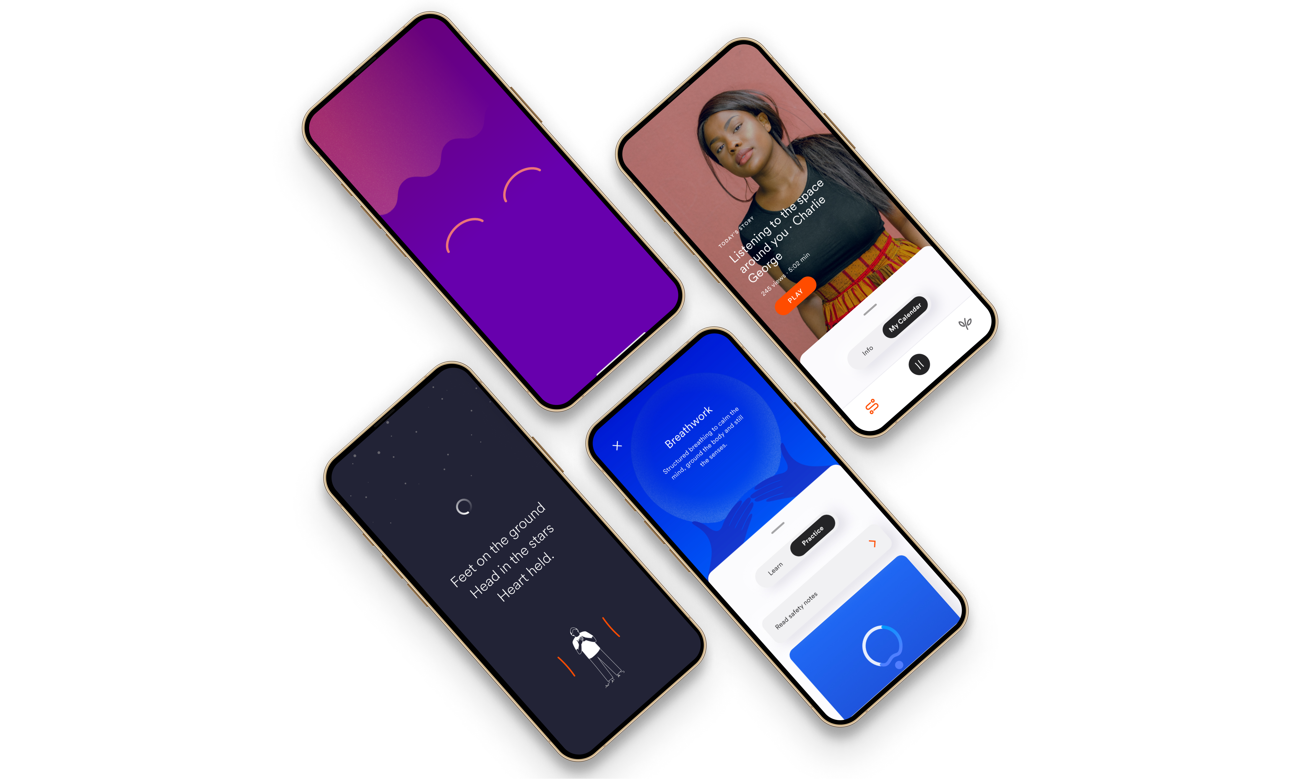
Light is a mindfulness platform designed for personal growth and human connection, offering accessible techniques to discover balance and foster deeper connections in life.
My Role
I led the Product Design process end-to-end, from early-stage research to developing high-fidelity prototypes, collaborating closely with the product manager, engineering team, and the client.
The outcome
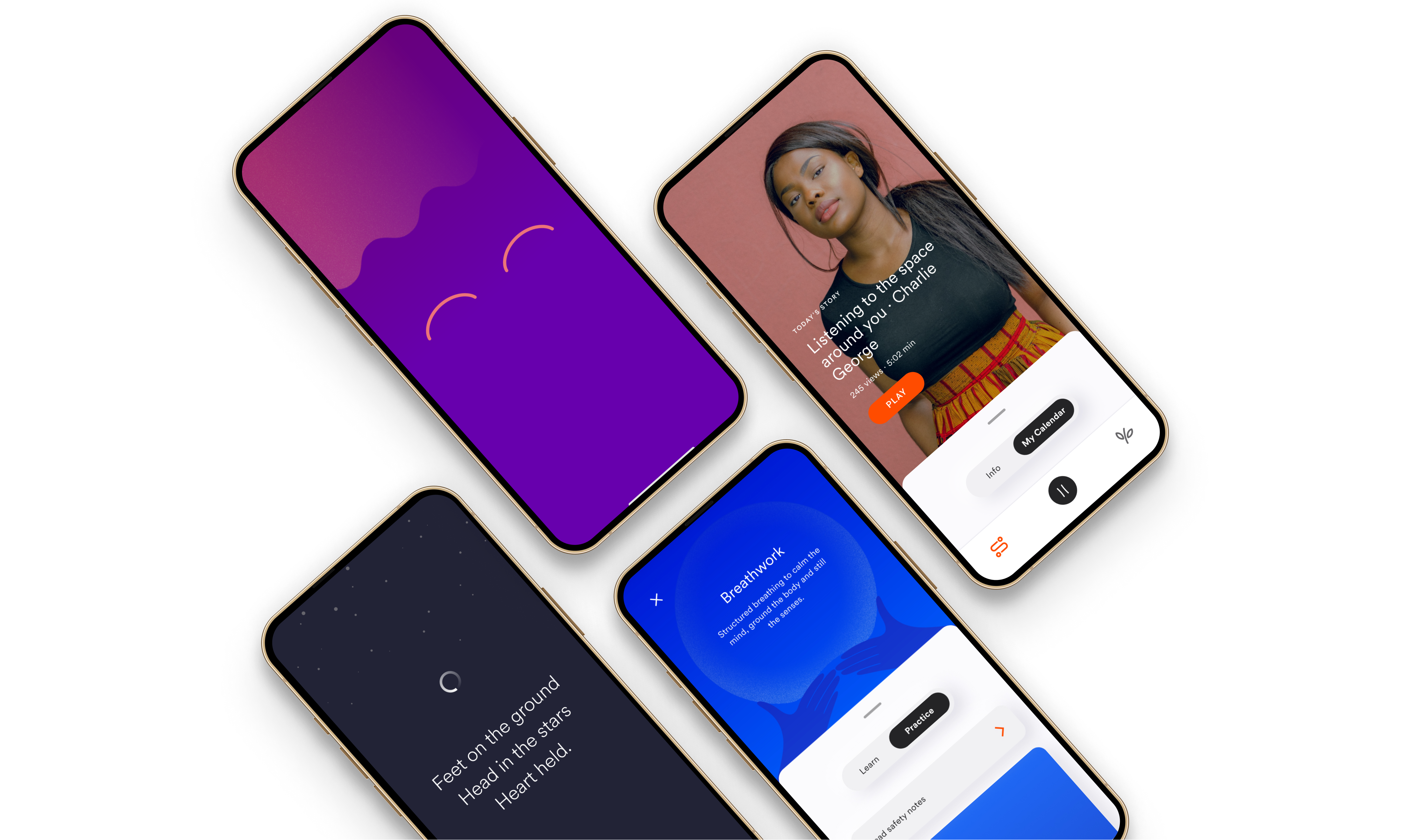
We successfully developed an iOS and Android app, currently in the pilot phase with tier-1 and innovative corporations, including Google, Accenture, Cool Planet, and Pizza Hut.
How might we create a Minimum Viable Product (MVP) that reveals Light's unique value proposition, setting it apart from other mindfulness apps in the $4.5 trillion wellness industry.
Research indicates that mental health is a growing global concern, affecting approximately 1 in 4 adults. People are actively seeking tools to cope with everyday life. While they download mindfulness apps, a significant number struggle to maintain a routine and benefit from their efforts. In fact, our research uncovered that 93% of users discontinue using existing mindfulness apps within the first 30 days.
We asked ourselves: Why is this happening, and how can we help users consistently access and engage with various mindfulness techniques? Our research highlighted several major pain points for users:
- Assisting users in building and maintaining a routine.
- Simplifying navigation through a vast amount of content.
- Guiding users to discover techniques best suited to their needs.
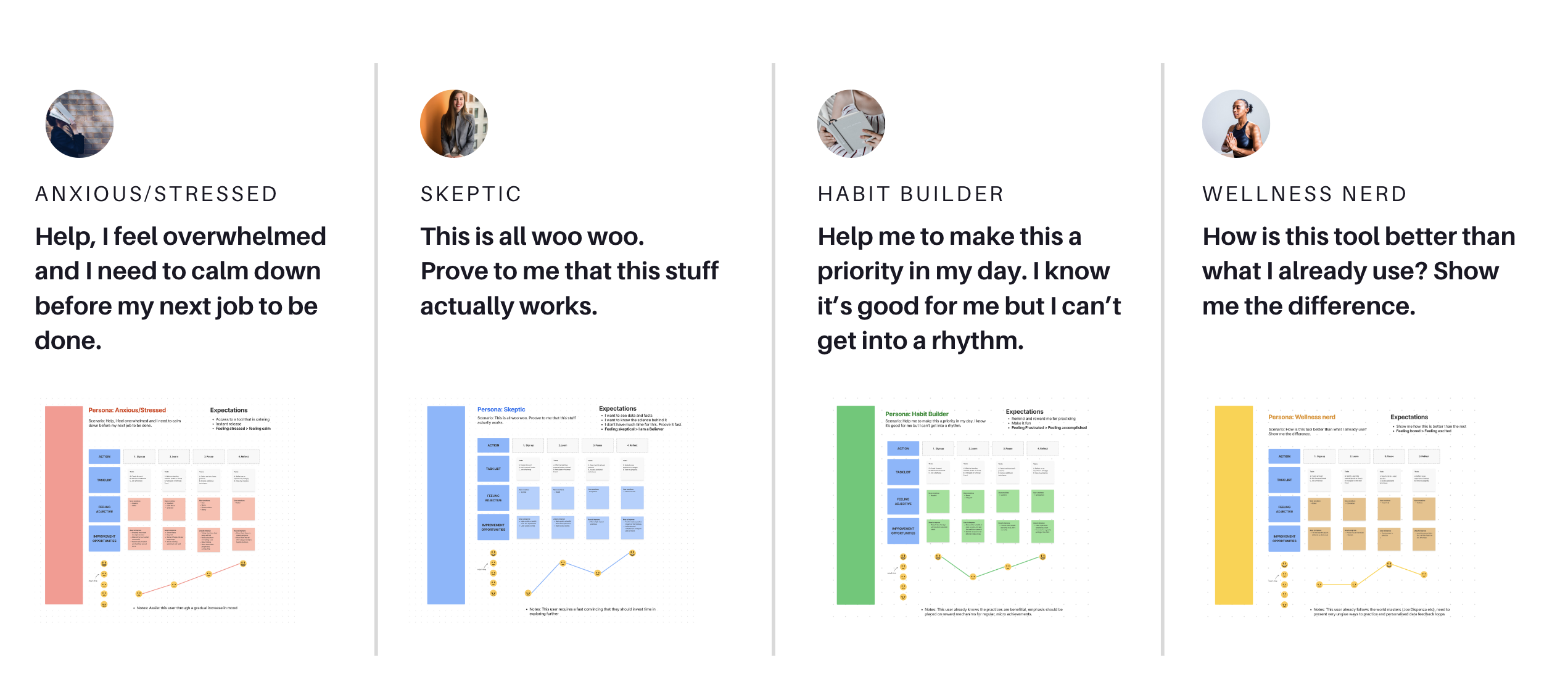
Defining personas
In response to these insights, we initially started by defining personas. However, as we delved deeper into user behaviour and preferences, we realised the need to pivot toward a more intricate segmentation approach, grouping users based on shared characteristics and needs.
Discovering the core user journey
We focused on understanding the core jobs to be done for Light's persona groups and what motivates them to return to the app. Achieving clarity on this front required considerable time and multiple rounds of iteration. Together with the product manager, we engaged in discussions and experimentation, ultimately defining the core user journey as: learn, do, reflect.

Key Design Moments
Our key design challenge was how to boost users' confidence in their mindfulness journey while minimising feelings of guilt associated with missed days or broken streaks.


How might we effectively demonstrate progress in one's mindfulness journey when it inherently lacks a clear pathway?
We initiated this process with an ideation workshop that encompassed competitor analysis, Crazy 8s brainstorming, exploration of intrinsic and extrinsic concepts, and sketching and prototyping.
The central question that arose from the ideation workshops was: How might we effectively demonstrate progress in one's mindfulness journey when it inherently lacks a clear pathway? Furthermore, as we were building an MVP and had not yet integrated biometric features, this challenge was particularly complex.
Concepts from the ideation workshop

Concepts from the ideation workshop
After evaluating various concepts, the winning idea was the emotion tracker. We chose this concept for several reasons:
- Users can monitor their emotional state before and after mindfulness practices over time.
- Users gain empowerment by recognizing and understanding their emotional states better.
- This concept positions us for future integration with biometric features.

UX and UI decisions

Learnings & Reflections
- Designing for an MVP presented restrictions that also served as an opportunity to clarify which features are valuable for early adopters.
- It forced us to work very closely with the engineering team to understand feasibility and ideate a plan B, C and D.
- Our partnership with the client and seamless communication with the engineering team were instrumental in collaborative problem-solving. This project stands out as one of the most rewarding experiences in my professional career.
Copyright 2020. JOK. Design
